
Drupal kick starter Drupal distribution for component-based site building
This project is maintained by 
Block Types
These are the block types that Provus includes.
- Accordion
- Banner
- Short Banner
- Columns
- Files list
- Line separator
- Link Group
- Number Group
- Person list
- Photo Gallery
- Social feed
- Tabs
- Text
To add a block to the layout of your page, you simply click ‘Layout’, then decide which section you want to add the block to, and at the bottom of that section select ‘Add Block’.


Blocks are organized by type:


This is a very brief description of each block type with a demonstration of the potential outcome:
Accordion
- This allows for a verticle list of content that will expand when the title is clicked(also closes any currently expanded content).
- Can create new item or use existing item.
- Normally used for FAQ lists.
Example:

Banner
- Allows for a background image for a site banner
- You can also add a Logo image, Heading, Subheading, include a Search Block, and add an image of a Person

Short Banner
- Allows for a background image for a site banner
- Only allows you to add a Heading or Subheading
- This is smaller to take up less real estate for users to start seeing other content easier
Button
- Allows you to create a linked button to a URL
- The title ‘Test Button’ can be removed
Columns
- This block allows up to three columns of either text or media
- Can be new items or existing items
Title can be hidden

Files List
-
Allows you to create a ‘List’ or ‘Table’ of links to files
-
Files can be Audio, Document, or Image
List:
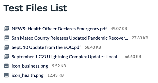
Table:

Line Separator
Creates a horizontal line to separate content

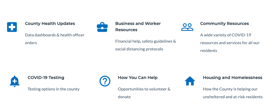
Link Group
- This has many options and uses
- Allows for manual or automatically generated links in a variety of group options
- Automatic links could be ‘News’ or ‘Articles’ or a list of people, etc.
- Manually add content with links to either relative or absolute paths
Can be displayed as:
- Carousel - Horizontal list of items possibly with a scrolling arrow
- 4 Card Featured - Lists most recent 4 items with the newest being on the left in a larger format, and 3 on the right in a vertical list
- Column Row -
- Grid 2, 3, or 4 - horizontal rows of items wrapping to a new line after selected number of items are displayed
- Allows for a link after the group - could be used for a ‘View More’ button


Some examples:
4 Card Featured:

Link Group : Grid 3 : Square Card Image:

Grid 3 : Card Text Link w/ Icon:
Number Group
- Allows for a ‘By the Numbers’ group
- Uses icons and numbers with labels

Person List
- Creates a list of persons of a user-selected type
Photo Gallery
- Creates a slide show of images

Social Feed
- Creates a block of the most recent posts of either Twitter, Facebook, or YouTube social media type
- Can be single, or multiple posts

Tabs
- Can have one or two allowed groups(tabs) of content
- Can be a ‘Link Group’ or ‘Text’
Link group type follows same guidelines as previously described

Text
- Uses basic WYSIWYG editor for adding a text block to the node
